INNOVID MEASUREMENT/INSIGHT DASHBOARD AND PRODUCT DESIGN
Innovid is an online advertising technology company that offers services used by advertisers and publishers for the distribution and management of digital ads.
Learn more about what Innovid does.
Role
Product Design: Candice Yoo
Product Management: Dan Cox, Raj Muhar, and Edmond Chan
Front-End Dev: Daniel Ji, Jacob Worrel (Stack: React, Node)
Duration: 2 years
As the sole Product Designer of the Measurement Team at Innovid, I:
1. Improved usability and interactivity across the product. Established Measurement as its own power product upon launch.
2. Insitigated improvement of Measurement product user experience and resulting in increased customer satisfaction and rating. The product advanced significantly from being merely a poster-like single page spread to more than 6 different measurement tools to view and interact with their ad performance data.
3. Emphasized the importance of a design system across all LOB and teams. This reduced discrepancy across different LOB and improved overall understanding of UX decisions by all teams, not just Design.
Business Goal
Innovid wanted to build the next generation Measurement platform and tool that measures linear, CTV, and omni channel (Desktop & Mobile) digital data for TV advertisers.
Advertisers need always-on, actionable insights to evaluate the performance of both their media and creative. The product needs to encompasses a broad set of Key Performance Indicators (KPIs) that provides measurement flexibility.
When the solution to something so important is decided upon by the stakeholders prior to reaching the UX designer, it’s difficult to overturn that decision. I needed data to prove that conjoining the two products was the best way for our users.
We would also announce to the pre-existing users that we have expanded the analytics platform and now also offer measurement/insights.
Personas
Advertisers need always-on, actionable insights to evaluate the performance of both their media and creative. The product needs to encompasses a broad set of Key Performance Indicators (KPIs) that provides measurement flexibility.
Challenges
The main challenge we faced is that we had to build something from ground up while keeping in mind that this will live alongside the pre-exisitng Analytics platform based on the company’s assumption that this will best serve the customers. While Analytics and Measurement serve different needs (Analytics: campaign report Measurement: users will be able to take action based on insight provided) they needed to be conjoined. This may cause a lot of discrepancies and confusion for the user between two products.
The main challenge we faced is that we had to build something from ground up while keeping in mind that this will live alongside the pre-exisitng Analytics platform based on the company’s assumption that this will best serve the customers. While Analytics and Measurement serve different needs (Analytics: campaign report Measurement: users will be able to take action based on insight provided) they needed to be conjoined. This may cause a lot of discrepancies and confusion for the user between two products.
When the solution to something so important is decided upon by the stakeholders prior to reaching the UX designer, it’s difficult to overturn that decision. I needed data to prove that conjoining the two products was the best way for our users.
The Process
1. Research and evaluate currently existing Analytics platform where Measurement Insights Product will be attached to and undertand the customer experience.
2. Define who the customers are and the issues they might be facing. Then documented usability issues in order of priority. Then decided where to make improvements or changes.
3. Determine if changes are feasible within time constraints with the developers and product managers.
4. Whiteboard ideas, create lo-fi wireframes, then present them to Product Managers. (repeat this until #5)
5. Create Hi-fi design concepts in sketch and export for Invision for developement.
Whiteboarding & Gathering Information

Understanding and Identifying the Problem (in order of priority)
- Navigation
- Left-nav: Discrepancies in how the navigation functions. Analytics uses left nav as page jumps and Measurement requires a left-nav in order to list a long list of different pages it consists of.
- Top-nav: Marketing team highly emphasized “Measurement” had to be showcased in the top main navigation front and center to entice our users that this is a new feature. This made the main nav cluttered if it lives alongside logo, icons, campaign names, and agency and brand names.
- Non-interactive
Pre-existing rough measurement dashboard is barely interactive and poster-like. We need a tool that is functional and simple yet the customers should be able to drill deeper into these informational diagrams.
-
Monumental data to work with
How do I translate this to communicate this to our users visually without confusion and chaos?
Solving the Problem
Focused on 3 main areas to improve upon:
-
Navigation
-
Content
-
Tools/Widgets
Through our research, we found out that only about 15% of our Analytics users visited Measurement and view versa. This also mainly occured because they happened to click on our newsletter and not due to them discovering Measurement from the Analytics platform. These products were serving two totally different users and needs. With this information, (and to my glee) we decided to separate the two product which allows two products to function differently as intended. I moved the page-level navigation to the left-nav instead of the top where it is cluttered, improving the overall experience in navigating through pages.
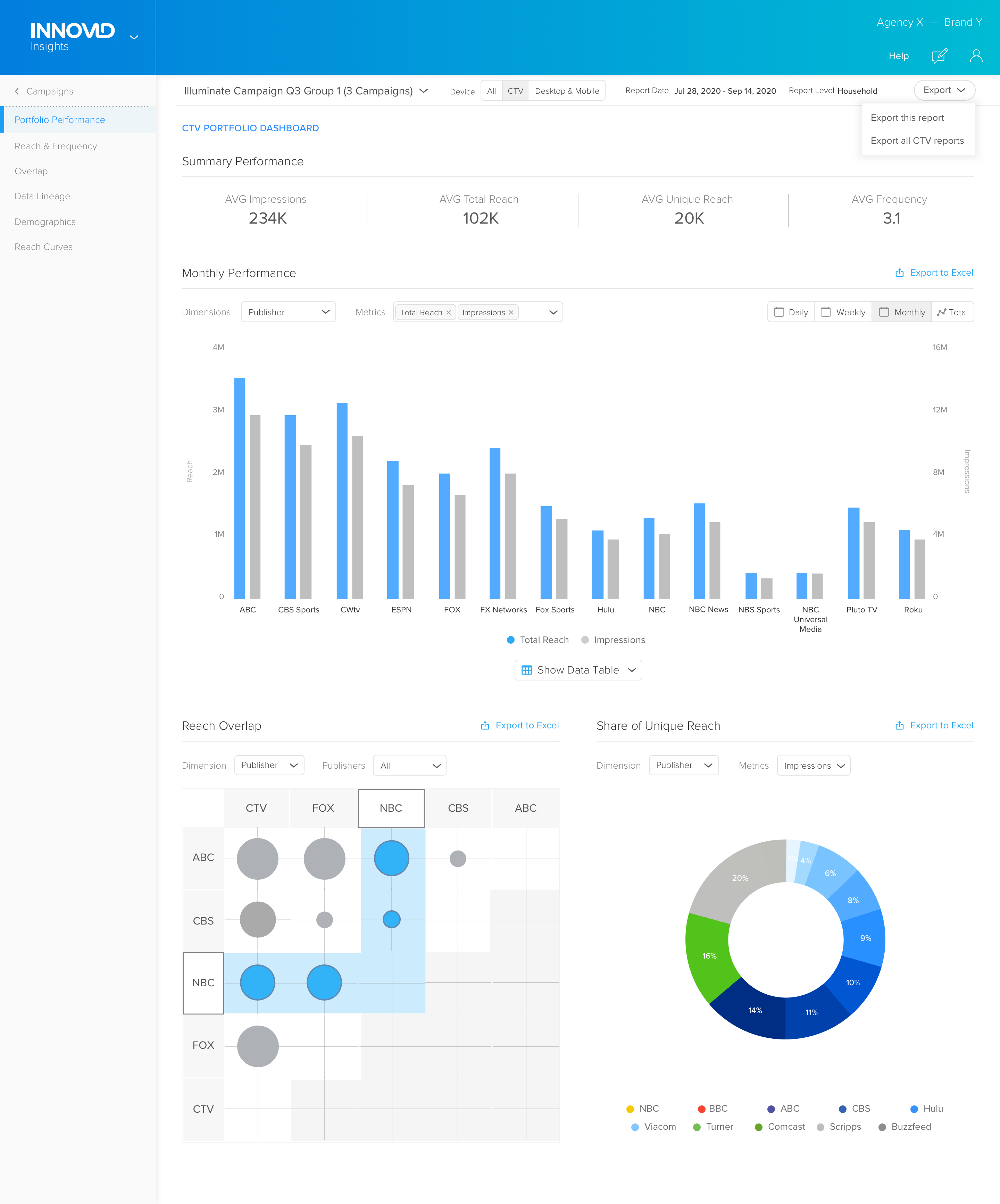
As for content, we needed to make sure this product doesn’t fall short of our customer’s needs. We made sure there were plenty of interactivity and ability to really drill into their data and allow our robust data science capability shine. Over time, we built important pages such as Audience, Reach Curves, Reach & Frequency, Data Lineage, and Demographics.
Our initial goal was to improve and help advertisers find information they came to look for easily and quickly while allowing pre-existing users from Analytics Platform to visit and discover the Measurement product tool. Overtime, by recognizing the importance of research and data, we were able to deliver a product that better serves our users.
This humble experience taught me how to be agile in an ever changing environment and reminded how I must think though all scenarios in my research from the very beginning.
Wireframing